
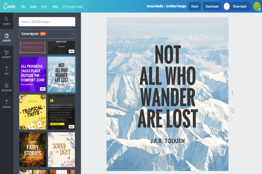
A quote card can fail in the quietest possible way. The background feels right, the type looks elegant, and one word is missing. A reader may still understand the sentiment, but the card no longer carries the quotation that the publisher intended to share. When the exact language is the product, a beautiful near match is still wrong.
The image workflow supports text-to-image and image-to-image creation inside Kimg AI. The platform also presents models designed for stronger text rendering. Those capabilities are useful for exploring a visual direction. They do not change the editorial contract: exact wording, punctuation, attribution, and line breaks need an independent proof layer.
Split Mood Making From Exact Copy Control
Treat the card as two layers. The generated layer establishes color, texture, lighting, and the amount of quiet space. The text layer carries the verified quotation in a normal design tool. This split may feel less magical than asking for a finished card in one prompt, but it gives the editor direct control over the words people will read and reshare.
Generate Space Rather Than Decorative Clutter
In the Banana AI prompt, describe where the empty area should sit and how calm it must remain. For example, ask for a soft painted landscape with a broad low-detail sky in the upper half. Avoid filling that region with birds, branches, sparks, or architecture. The goal is not merely blank space; it is a predictable contrast behind type.
Lock The Quote In A Plain Source File
Store the approved sentence and attribution as plain text before any visual work. Preserve spelling, punctuation, capitalization, and line-break preferences. If the quotation is translated, keep the original and translation together. That source file becomes the reference against which every exported card is checked.
| Production route | Advantage | Main risk | Best use |
| Generate art and text together | Fast visual concept | Silent wording errors | Rough direction only |
| Generate art, add type separately | Exact copy control | Requires layout work | Publishable quote cards |
| Edit an approved template | Consistent series | Background drift | Recurring collections |
The second route is usually the safer default. The first remains useful when a team wants to see whether a type treatment suits the art, as long as no generated wording is mistaken for final copy.
Choose the editorial route before generation, not after seeing a tempting result. When the card belongs to a recurring series, a stable template with a replaceable art field will usually beat one-off generated typography. It also gives readers a visual pattern they can recognize without forcing every background to look the same.
Keep The Art Layer Separate From Exact Wording
Build the background at the final aspect ratio so empty space does not disappear during cropping. The Kimg AI workspace includes an Image Size control with landscape, square, and portrait options. Choose the social or editorial format first, then generate the art. A square card adapted from a wide image often loses the very quiet area reserved for the quotation.
Use References For Palette Not For Copy
A previous card can guide color and material, but tell the model what it should preserve. Ask for the same paper grain and muted blue palette, not “make another one like this.” Do not upload a card containing text unless the review can detect accidental imitation. A clean art-only reference reduces that risk and gives the generator a simpler job.
Ask for a small set of related backgrounds only after one composition works. Keep the quiet zone in the same place while changing season, material, or light. That creates variation without forcing the type designer to rebuild the layout on every card. Reject any background whose focal object competes with the first line of the quote.
Add Conventional Type With Real Font Controls
Place the verified quote after choosing the background. Adjust size, line height, alignment, and margins with tools that keep the characters exact. Keep the attribution visually subordinate but readable. This step is also where accessible contrast should be checked rather than assumed from a large desktop preview.
Avoid solving low contrast with a heavy shadow behind every letter. First darken or simplify the artwork beneath the copy. Then choose a type color with a stable contrast margin. This preserves the mood of the card and keeps the quotation readable after compression, where delicate outlines and glows often become muddy.
Proof The Export Character By Character
Compare the final card with the source file, then ask a second person to read it aloud. Check punctuation and attribution as carefully as the main sentence. If the card uses a licensed typeface or third-party quotation, confirm those rights outside the generator. A clean image export does not resolve ownership or attribution questions.
Keep the editable file after exporting the Kimg AI artwork. Social teams often discover a spelling correction, a new attribution preference, or a platform crop at the last minute. A flattened image with generated lettering turns that small correction into another generation round. Save the source quote beside the layered design, not only in a chat message, and include the approval date. A separate text layer lets the editor fix the words without disturbing the approved art, color, or texture and makes translated versions much easier to produce from the same visual system.
Check Watermark And Usage Terms Before Release
The pricing page distinguishes plan features such as no-watermark output and commercial licensing. Confirm the active plan rather than copying an assumption from an old project. Google also describes SynthID provenance for current Gemini image models; invisible provenance is different from a visible logo. Keep a record of the tool and plan used when the card is intended for paid promotion or a client deliverable.
Quote ownership is a separate question. Public-domain status, permission, and accurate attribution should be checked before the visual reaches production. A commercial image license covers the generated art under the stated plan; it does not automatically grant rights to a living author’s sentence, a translated passage, or a recognizable third-party photograph used as a reference.
Inspect The Card On Every Delivery Surface
Review the saved file, the social preview, and any compressed version created by the publishing platform. Compression can soften thin letters or turn subtle contrast into a readability problem. Kimg can help produce the art, but the final type layer must survive the channel that actually delivers it.
Let The Image Support Words It Cannot Change
Kimg AI fits editors who want a distinct visual mood without surrendering control of an exact quotation. It is less suitable as a one-click finalizer when the wording, attribution, or legal status has not been checked.
Generate the atmosphere, place verified type, proof every character, and inspect the delivery surface at its real size. Keep the layered source beside the export and record who approved it. Art can deepen the feeling of a quote. It should never quietly rewrite what the author said.
